London based photographer Vish Vishvanath writes en route from Guatemala with two pictures. He first sent photos of two different scenes but I asked him if I could talk about two variations of the same scene. You’ll learn why shortly.
For context, Vish explains that the pictures are from his MA final project entitled ‘Five Crores and Fifty Lakhs’ shot last summer in Gujarat, India and that these two were made during “my second trip to learn about the nomadic and de-notified tribes, and by sheer luck, Steve McCurry was in town, shooting the same subject as me. I love his work, have five of his books and he was kind enough to meet me and discuss at length my project and even bought me lunch. He thought that I really needed to show them on the move, moving, traveling, and I spent a lot of time figuring out how to visualize this. We went out for a few hours after this shooting in a local neighborhood, I learnt a heck of lot. Lovely guy.’
Steve’s story on nomadic Indians ran in National Geographic magazine a few months back. It’s worth finding, if you haven’t seen it. And if you don't subscribe to National Geographic, you should.
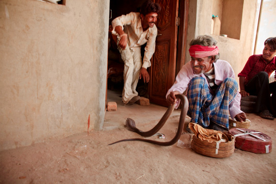
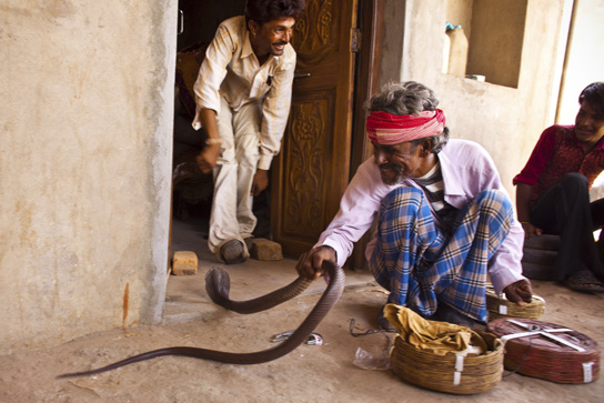
Vish’s two pictures were made in a village where mostly entertainers and snake-charmers live. Here are the pictures:

 Both photos by Vish Vishvanath
“The man in the doorway has lost control of his snake and his friend has rescued him.”
The man who lost the snake is the son of the “chief of the village, an expert charmer and magician, and he wanted to show me that he too could do snake charming. But the truth is, the skills are being lost. Snake charming is illegal, or rather, keeping snakes is.”
“I don't really know what I'd like you to say about them. I know they have weak points, it's easy to spot these in retrospect, but that's ok. They're what I have.”
I'd say both are nice frames. They both work as images. The critical assessment is, which conveys the quality of what’s going on better? It seems most important to first feel the tension, the potential danger of the situation and then perhaps the embarrassment of screwing up the snake handling.
Of the two pictures, the second photo conveys both qualities better. The differences are not huge but they are significant. Being that much closer to the snake in the second photo makes a huge difference in the feeling of tension. The snake is arched more strongly as well and there is more of a sense that things are out of control than in the first photo. Both faces are sharp in the second photo, which helps connect with what’s going on, yet the blur of the hands and snake shows the intensity of their response.
That the man is looking away from the snake in both photos suggests that he’s more concerned about what other’s think than he is about the snake. But I could be reading this into the photo.
Then there are several subtle niceties in the second photo that add to the tension: the angle of the man’s face with the red bandana creates a plane that goes more strongly into the frame; there is deeper triangulation between the three faces; the man’s left arm on the right side of the photo is not visible, which pushes him out of the frame instead of being contained within it; everything is off center, akimbo, compared to the centered man in the first photo; there is greater tension in the man’s hand grasping the snake and you can see more of his hand and fingers (touching a snake being an unpleasant thing for a lot of folks); the man’s foot is pointed directly at the snake, is the same size as the snake’s head and is closer to the snake, creating a more immediate connection between the two; there’s a bigger gap between the snake and the man catching it, so greater tension there as well.
All of this takes a couple seconds to note visually, much longer to write about it.
The most important gauge of which image is more successful is the first millisecond of reaction, as I’ve written a few posts back. In that instant, which image creates a greater sense of “yow!”? Another way to explain the core difference between the twom images is that you have to enter the first photo whereas the second one comes out at you.
Another aspect to guage is the peakness of moments. The second image of these two is more peak. Every situation has a an ebb and flow, a rise and fall. Presenting images at the peak of situations usually increases the uniqueness of the image.
And if you can say of an image that it is unique, that's a high standard met.
