A photographer I’m working with asked me yesterday if I think photographers can edit their own work well. I answered that no, generally, I don’t think they can. The answer was not about job security for people like me, who edit photography for a living. Honest.
Some photographers can edit their own work well. What distinguishes whether you can or can’t edit your own work is hard to say. I do know that the clearer and more dimensional you are in the type of pictures you set out to make of a given setting, the more likely you are to chose the photos that accomplish what you set out to do.
But that doesn’t mean you’ll recognize or value the surprises, photos that do something other than what you intended. Photographers tend to pass over their photos that were easy to make. And they overvalue photos that were very difficult to make or photos that gave them a great experience or included great smells or sounds - things that you can’t tell from looking at a picture. In the end, the photo is not about you, it’s a freestanding entity that exists independent of the experience or the person who made it - while at the same time, the photo is an expression of who you are and what you are capable of saying.
There’s also a tendency to chose the types of photos that you tend to make, or a tendency to respond to pictures that reflect how your eye sees. I noticed that this week with another photographer’s work, where one tighter edit she sent me tended to be one type of composition while a subsequent, much wider edit had all kinds of surprising and much more varied and dimensional types of compositions.
That’s why there’s value for me to see a whole take from a given scene, with the photographer’s choices from that take, to get a sense of how a photographer works a situation, to see if the approach to image making evolves with the scene - and other aspects of the making of pictures. Then seeing what he or she thinks worked from that take tells me a lot about whether there is a disconnect between the making and choosing of pictures.
I’ve also noticed in judging contests that each judge votes for a certain realm of pictures. One won’t see pictures that are outside of that realm and therefore won’t vote for any photo that doesn’t fall in that realm, on the first pass of the judging.
Sometimes, if another judge votes for a given image that moves forward to a second round, a judge who didn’t vote for that photo before will clue into what’s working in the photo and will vote for it. But it took someone with a different, and usually more dimensional eye, to pull the photo in the first place. That’s why it’s not good to have judges with singular and similar backgrounds on a panel.
It’s as if we all have filters over our eyes that only allow us to see certain types of pictures, either in the making or the choosing of images, or both. Those types can be simple or complex but there is definitely a limit to what we can see and therefore what we put forward.
How do you overcome the limiting aspects of your filter? Or, how do you better edit yourself. Well, you can hire me to edit your work. That notwithstanding, it’s critical to establish an objective evaluation of your pictures in the first pass through a group. I’ve spoken about this process elsewhere on this blog so I won’t go into great detail here.
You can use my approach, which is to gauge the level of success of each of these aspects: quality of light, color, moment value, composition and whether the distance from the subject is appropriate. If any two of these aspects don’t work, chances are the photo doesn’t work. But if any one or two really, really works, then the whole photo probably works well. And if all five work in a given photo, apply for sainthood immediately.
You also have to be aware or your tendencies, your filter. A lot of people tend toward center-based images or pictures where elements always split the frame and therefore only chose photos where that happens. Stop that.
And if you find yourself applying rules to pictures, stop that. Here are some rules I’ve heard people espouse with absolute sincerity: You can’t blow out the highlights, it must follow the rule of thirds, no blood, no snakes, you can’t cut off heads or joints, there should be no empty space around people, and on and on.
After photos clear the first hurdle of the five considerations and you’re no longer applying stupid rules to what you chose, you’ve elevated a set of pictures. Now move away from the objective and ask yourself if you feel something when you look at each of the photos you’ve moved forward. If the answer is yes, elevate the photos that elicit a response. If photos don’t, leave them and move on.
Continue to do this until you have elevated the photos that are most successful in the five elements and elicit the strongest responses. Then put photos next to each other that create an even greater response and put those next to others that create yet more of an experience and you’ve created a story, a book, a gallery show from a day, a week, a year, a life’s body of work that is now represented to its potential. Piece of cake. No sweat. But then, that’s what I do for a living.
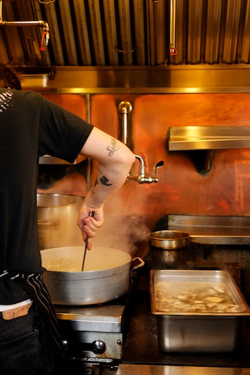
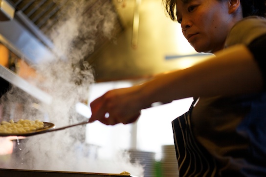
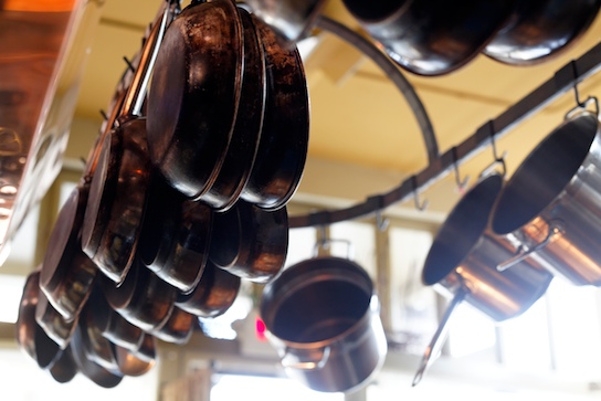
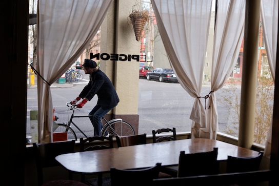
Here are five pictures I made for a magazine assignment that illustrate the point of seeing pictures that capture the sense of what I was trying to convey from this restaurant. This is Gabriel Rucker's Le Pigeon restaurant, here in Portland. He's a cutting edge chef. He turns a French approach to food on its ear, in some cases a pig's ear. So the photos should feel different from standard fare. They should make you feel uncomfortable and yet want to be there, to see more and to taste.
See what you think.
 Gabriel preps a special dish while two other chefs work in the diminutive kitchen.
 The goal here was to convey a sense of compactness, quality of place and intensity, or something like that.
 Getting close was critical to convey a feeling of intensity and quality. The moment of the drip of water adds the critical element.
 I love details of place to create a unique feel.
 I wanted to connect the restaurant to Portlandia. What luck when a biker with red gloves road through my composition.
