A few people have said they enjoyed the two pictures feature I did for a few months last year so I’ll revive the idea, which is to talk about which of two pictures works better. Send me two pictures if you want feedback on which is better.
In this case, Florida-based humanitarian photographer Benjamin Rusnak offers two pictures from his project about the challenges of life between the Tropic of Cancer and the Equator. We’re working together on a book edit from the body of work, which is all panoramic and quite good.
The panoramic format is inherently challenging. Getting the entire frame to work is tough. It’s like getting two 35 mm frames to work simultaneously. Ben has mastered that.
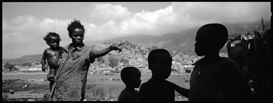
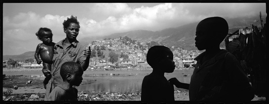
These two pictures are so nearly alike and yet are so different. Both are effective so the choice likely comes down to personal preference. Unless you look at the images from a qualitative perspective. When you get down to a few images that appear equally strong, it’s better to judge them based on the quality they convey and which quality is most appropriate, instead of using personal preference as the measure.
You can use the same approach in a publishing environment. Don’t say “I like this one.” Because others in the room will “like” other pictures and you’ll likely end up disagreeing. Instead, first come to an agreement about the quality that you think is most appropriate to convey. Then chose the photo or photos that best convey that quality.
Between these two pictures, there is less tension in the top picture, it’s moments are more complete, there’s no question of what is happening. The woman is pointing - a complete action - and the boy’s hand on the right side of the frame is resting fully on his brother’s shoulder, and so on. This image feels comfortable, complete.
In the second image, there is more of a feeling of tension, the mother is about to say something, about to make a gesture, the boy on the right is almost touching his brother, the boy on the left is moving from sun to shade, there is greater separation between the boys and their mother. All of these things bring about a feeling of tension.
I chose the second photo in the book edit because of this greater sense of tension. That quality played better where the photo landed in the sequence. That’s often the case, where if you set out to make pictures that convey a quality you’ll be able to chose them based on how well they convey that quality - or qualities. By sequencing or playing images together that convey qualities rather than just showing different things happening, you’ll multiply the third affect brought about when images sit by each other.
When you’re split between two or more similar photos, asking yourself which one conveys a more appropriate quality is a good way to decide.
There are other factors, such as, which one has better depth. I spoke to that above. Another way of expressing depth is to ask which image has more dynamic triangulation? Between these two, the second image has more triangles at more angles/planes that pull you into the frame. The first picture happens primarily on one plane - you can draw a straight line from the boys to mother.
Then look at negative spaces. In the top photo, there are pinch points around the boy’s head in the middle of the frame and between the two boys on the right that trap the eye. Shadows on the right side of the frame unify the boy on the right with the background, further flattening the image while in the second picture, the patch of ground on the lower right of the frame separates the boys from the background.
It’s no small deal that the second image would play better on a magazine or book spread. It could cross the gutter without sacrificing a critical part of the picture.
Both images succeed in letting the eye travel to infinity and both place the main subjects in their settings well, which is huge. It’s a great example of building the frame from infinity forward - that’s Sam Abell’s compositional expression.
Nicely done Ben.

