(This is another post that comes from my invitation to all of you to send me two of your pictures to get my thoughts on them. Send two photos at 544 pixels/72 dpi to me at: tekamah at me dot com. Explain something about yourself, the photos and what you'd like for me to address about them. And feel free to send me an 8x10 print for the effort.)
Elbert Chu is a New York City based photographer who is on the path of changing careers from Wall Street to documentary photography. After two years of assisting an editorial photographer, he’s now striking out on his own.
He sends two sets of pictures from a recent trip to Haiti and asks me to consider which in each set is the more telling and successful of each pair. It’s a bargain day, then - two for the price of one - given that I woke up even earlier than usual.
Here are the first two pictures:

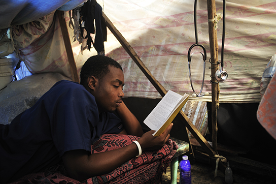
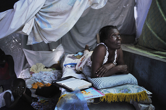
 Both photos of Nurse Jeff by Elbert Chu
They are of Jeff, a nurse whose training was cut short by the earthquake. Elbert says of Jeff and making pictures: “I met him in a medical clinic across the street from the National Palace. These images are in the tent shelter where he stayed. I found it difficult to keep the pictures intimate and still show the desperation of their situation. I also wanted to show that he was a nurse.”
There is such a dramatic difference between the two pictures that it’s hard to believe the same person made both of them. The first is a prime example of an oval picture, where not much outside the middle oval of the farm is important. There’s only one plane of activity, no triangulation that creates a feeling of three dimensions - except the little peak of light on the left side of the frame - and everything falls within the frame.
The second photo has depth, dimension, tension. There is triangulation aplenty; your mind completes the photograph outside the confines of the frame; there is foreground, middle ground and background; color, light, moment, composition and distance from the subject all fall in place to convey a sense.
Distance and composition are the most critical elements in this setting. It’s a good example of how you can use the two aspects to convey a qualit, in this case one of tight confines and chaos. Moment value in the second photo is increased just by the way his index finger is holding the page. The passive quality of what he’s doing creates the yin to the yang of the tension of the composition and close proximity to the scene that convey a sense of chaos and intimacy.
Neither image would be a lead image in a story about Jeff. They provide a moment away from the intensity of what he does, which is important to the story but it’s not the overarching image that would lead a body of work.
And here’s the second set of photographs:

 Both of these photos also by Elbert Chu
The ideal would be to combine aspects of each photograph into one image, if the goal is to convey sweeping devastation and how it affects the lives of Haitians. Limited to a choice between the two, the photograph of the woman on the bed is considerably stronger as an image. It’s sadly beautiful, that fine balance of yin and yang that most great photographs have.
One way to know whether an image is successful as an image is to try and crop the image. The photo of the woman would die if it were cropped any more than a tweak. While the photo of the man could be cropped any number of ways. It’s stronger as a vertical, for instance.
Then there’s the cliche of photographing people’s backs. It’s in the same category as the silhouette. Silhouettes and backs neuter the scene so that the viewer can fill in the blanks, the details of the scene, as they please. Such photos are partial representations and are often called iconic because they can be what each of us brings to them.
That said, the photograph of the man does give a great perspective, a feeling that disaster goes on forever.
Each of the images is geometrically complex and has a clear priority of flow, our eye is guided through the scenes because of the way you made the picture.
