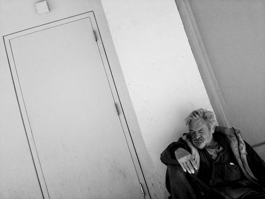
(This is another post that comes from my invitation to all of you to send me two of your pictures to get my thoughts on them. Send two photos at 544 pixels/72 dpi to me at: tekamah at me dot com Explain something about yourself, the photos and what you'd like for me to address about them. And feel free to send me a print for the effort.)
Salt Lake City photographer Trent Nelson wonders which of the two images I prefer from a street photography project he’s doing and posting to this site. He posts a new shot daily, only black and white, no cropping.
Here are the pictures:

 Both photos by Trent Nelson
These two photos fall into the everything being equal camp - talk about a throwback to economics class. With very similar images, chose between them by what is different. In this case, the critical differences, for me, are in the angle of the man’s face and the similarity of shape and size between his hand and the square above the door that create a ping and triangulation that doesn’t exist in the second photograph.
Almost all the planes of activity are parallel in the second photo. Just the slide angle of his face in the first photo creates a separate plane. His expression is maybe better in the first, too, but that’s more subjective. Start with the objective qualities first and then let subjective play into your decisions.
In general I hate photographs of the homeless that are disengaged grab shots. Trent must have engaged this man, or at least talked to him before making the picture, which shows a degree of respect, if not compassion, for his circumstance. That’s admirable.
